Problem
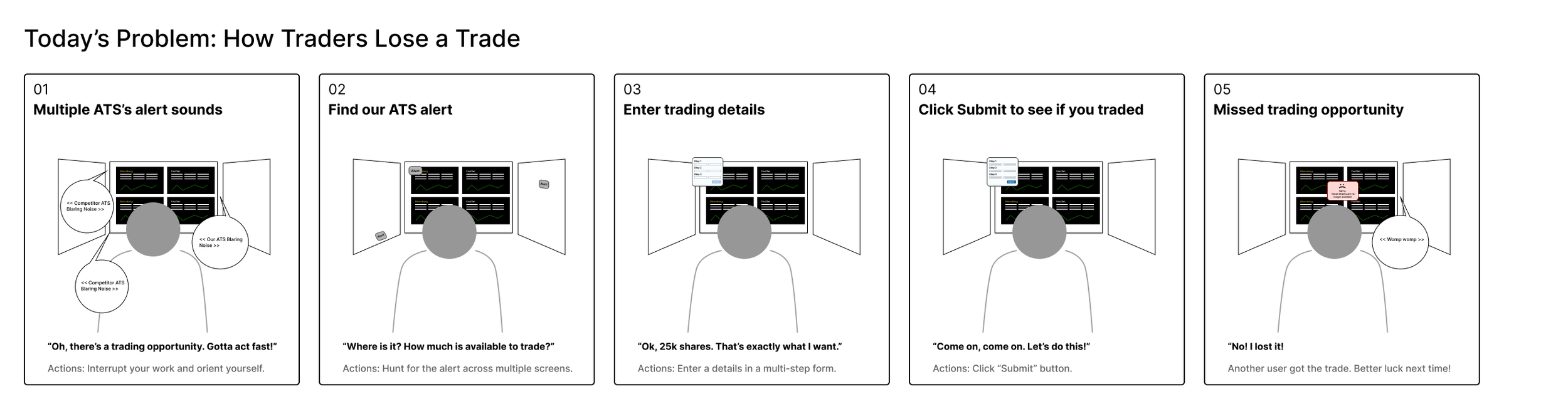
Block traders using this alternative trading system were losing trades they should have won. When a matching counterparty appeared, alerts fired simultaneously across three or four competing platforms — and traders almost always executed in a different product because this one was too slow. The ones who did choose this platform faced a second problem: even within the app, multiple traders raced for the same opportunity, and a slow execution flow meant arriving at the end of the process to find the trade already gone.
The client brought Lab49 in with a clear hypothesis: fix the execution experience and traders will use the product more, win more trades, and generate more revenue. The redesign wasn't a UX improvement project. It was a competitive survival story.
Context
Block traders manage very large positions — sometimes millions of shares of a single stock. They track and manage all their orders in an Execution Management System (EMS). For their largest trades, buying or selling that much on public exchanges isn't straightforward: moving that volume at once can destabilize a stock's price and expose holdings that traders need to keep private.
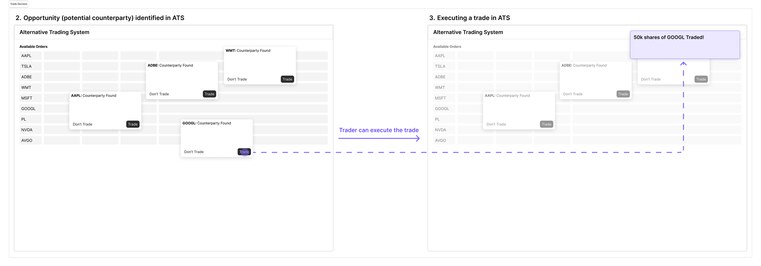
An Alternative Trading System (ATS) solves this. Traders send their largest orders from their EMS into the ATS, which quietly monitors for other traders looking to trade the opposite side. This is how a seller finds a buyer - or vice versa - privately and away from public exchanges. When a match appears, both traders are alerted simultaneously and have a narrow window to execute before someone else takes the opportunity.
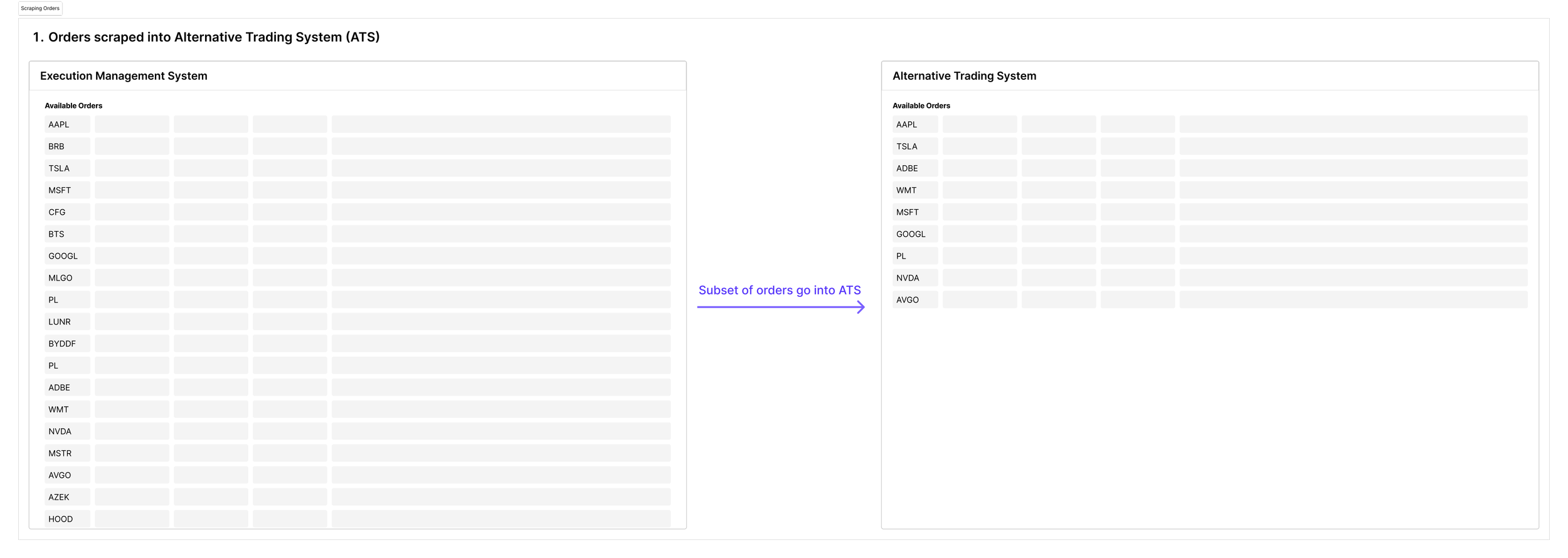
Most traders run three or four ATS platforms simultaneously, all scraping the same order book, all alerting for the same opportunities. Every platform is competing for the same trade in the same moment.
My Role
I led UX research and design for this engagement alongside another designer, who led visual design. The project ran in two phases: a ten-week discovery focused on understanding the current state, defining the core usability problems, and designing solutions; followed by a six-month build phase during which we designed all features of the product in close collaboration with development.
The discovery phase was the strategic foundation. Through user interviews and extensive sessions with customer support — who served as both stakeholders and proxy users with deep knowledge of trader pain points — we built a clear picture of where and why traders were losing trades. That research directly shaped the design priorities and the product direction we brought to the client.
Daily design reviews with stakeholders, product managers, and senior executives over four weeks kept the work moving quickly and ensured alignment at every step. This cadence was deliberate - in a competitive product context where speed to market mattered, a slower feedback loop wasn't an option.
Process
The research phase presented an interesting constraint. Block traders are difficult to access directly — they're busy, their time is expensive, and the organizations they work for are protective of it. From ten user interviews, extensive customer support sessions, and a body of existing feedback the client had accumulated over time, clear patterns emerged. Traders weren't struggling with the core concept of the product — they understood block trading and the ATS model well. The friction was almost entirely in the execution experience: finding alerts, acting on them quickly, and completing trades before someone else did. The problem was narrow, well-defined, and actionable.
Before moving into detailed interaction design, I mapped the full system architecture — the blotter, individual alerts, how multiple simultaneous alerts would interact, the execution flow end to end. Working at that level first made the detailed design decisions easier to reason about: you can't design a good alert interaction without understanding how it sits within the broader trading workflow and competes for attention with everything else on screen.
Design Story
The research pointed to two distinct but related problems: traders couldn't find alerts quickly enough, and once they found them, executing the trade took too many steps. We tackled both, and then confronted a third, more nuanced question: how much context should an alert contain?
Finding Alerts
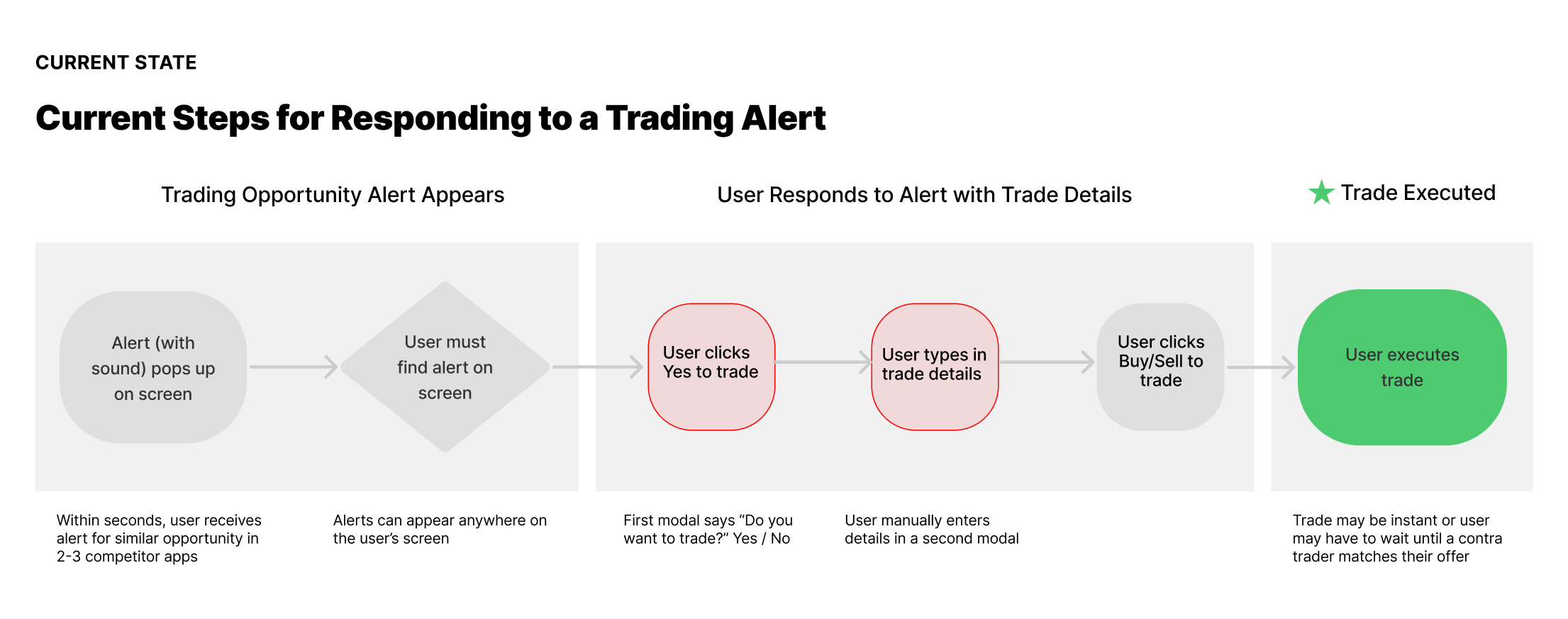
In the existing product, alerts appeared wherever there was screen space — which in practice meant they could appear anywhere, with no predictability. In a time-pressured environment where seconds determined whether a trade was won or lost, hunting for an alert on a cluttered screen was a significant and unnecessary cost.
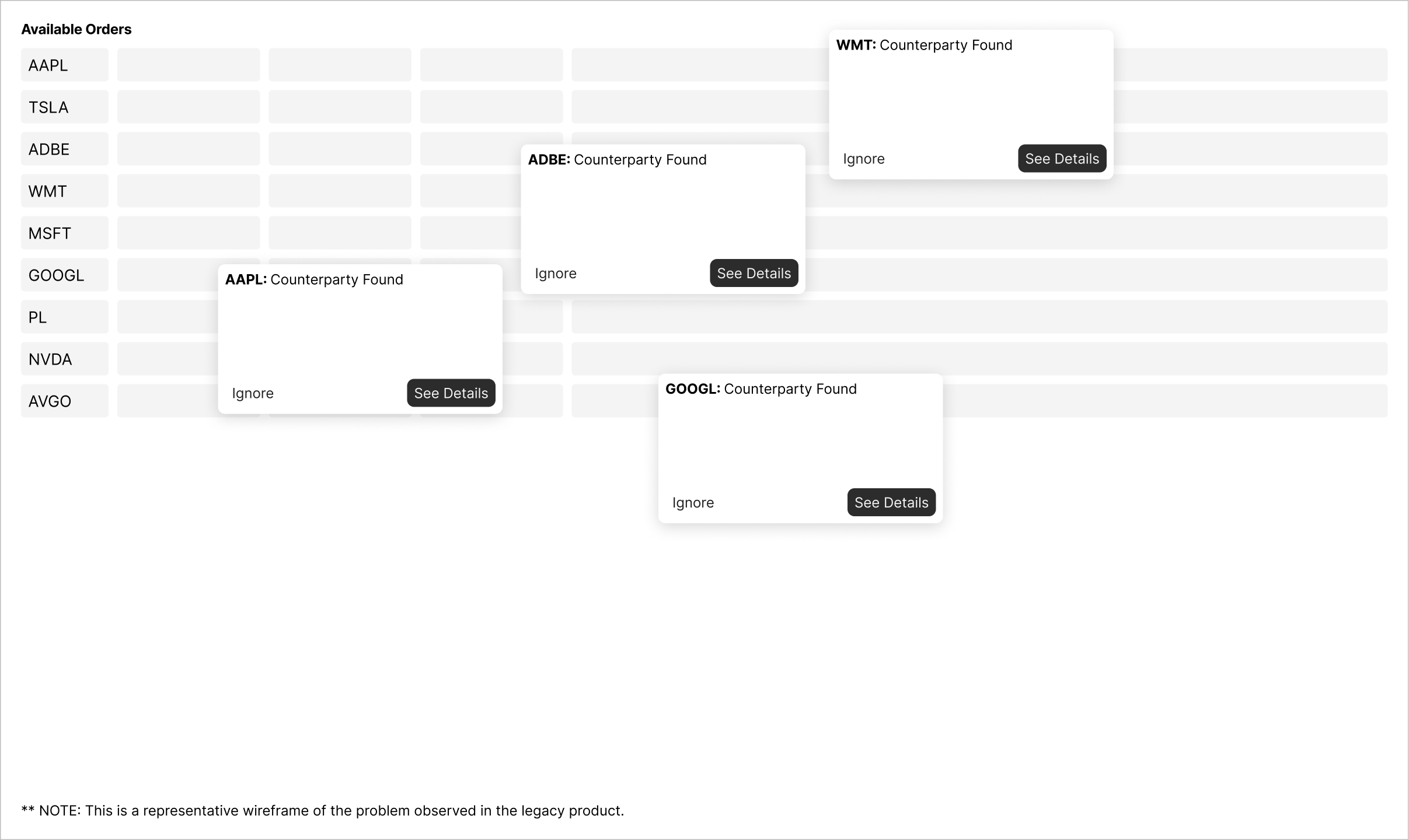
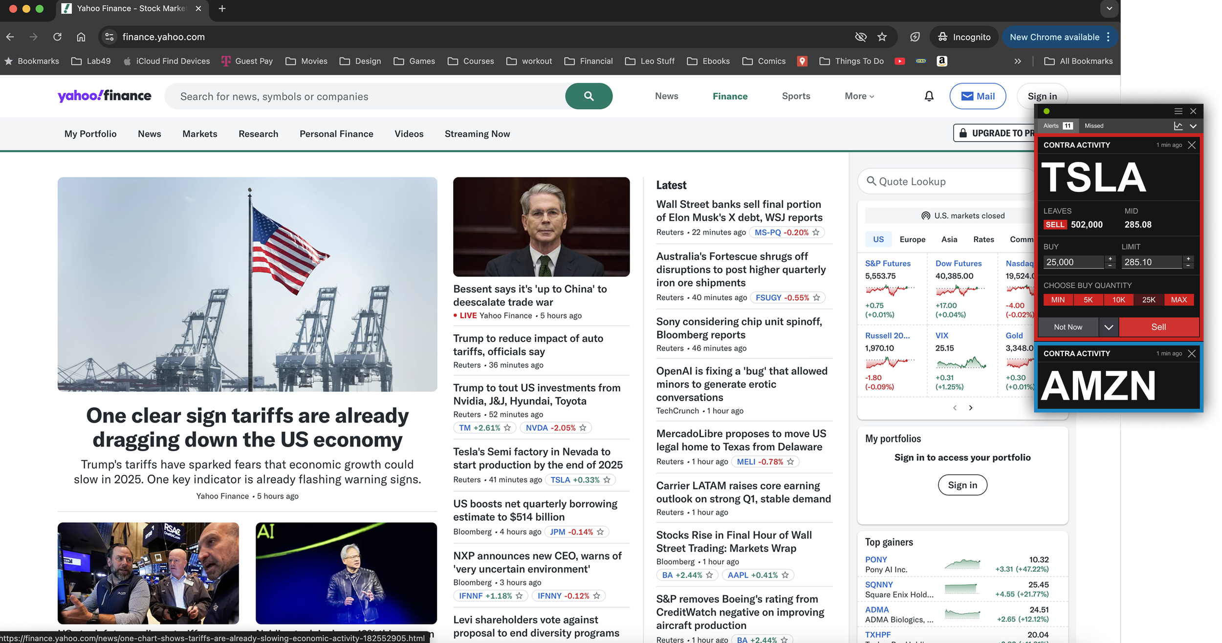
The solution was straightforward once the problem was clearly defined: alerts should always appear in the same place. We designed a stacked alert system where new alerts appeared consistently in a fixed location. As alerts accumulated, earlier ones collapsed below the most recent, keeping the newest opportunity prominent while preserving access to others. After several alerts, the stack compressed further to maximize visibility.
As alerts accumulated, earlier ones collapsed below the most recent, keeping the newest opportunity prominent while preserving access to others. After several alerts, the stack compressed further to maximize visibility.
Executing Trades
Finding the alert faster only mattered if the execution flow that followed was fast enough to win the trade. Research showed that the existing flow required too many steps: a confirmation modal, then a separate form for trade details, then a final execution click. In a race where multiple traders received the same alert simultaneously, each extra step was a concrete mechanism for losing.
How Much Context is Needed in an Alert?
The more complex design question was how much additional information to surface within the alert itself. More context might help traders make better decisions — but it might also slow them down and cost them the trade.
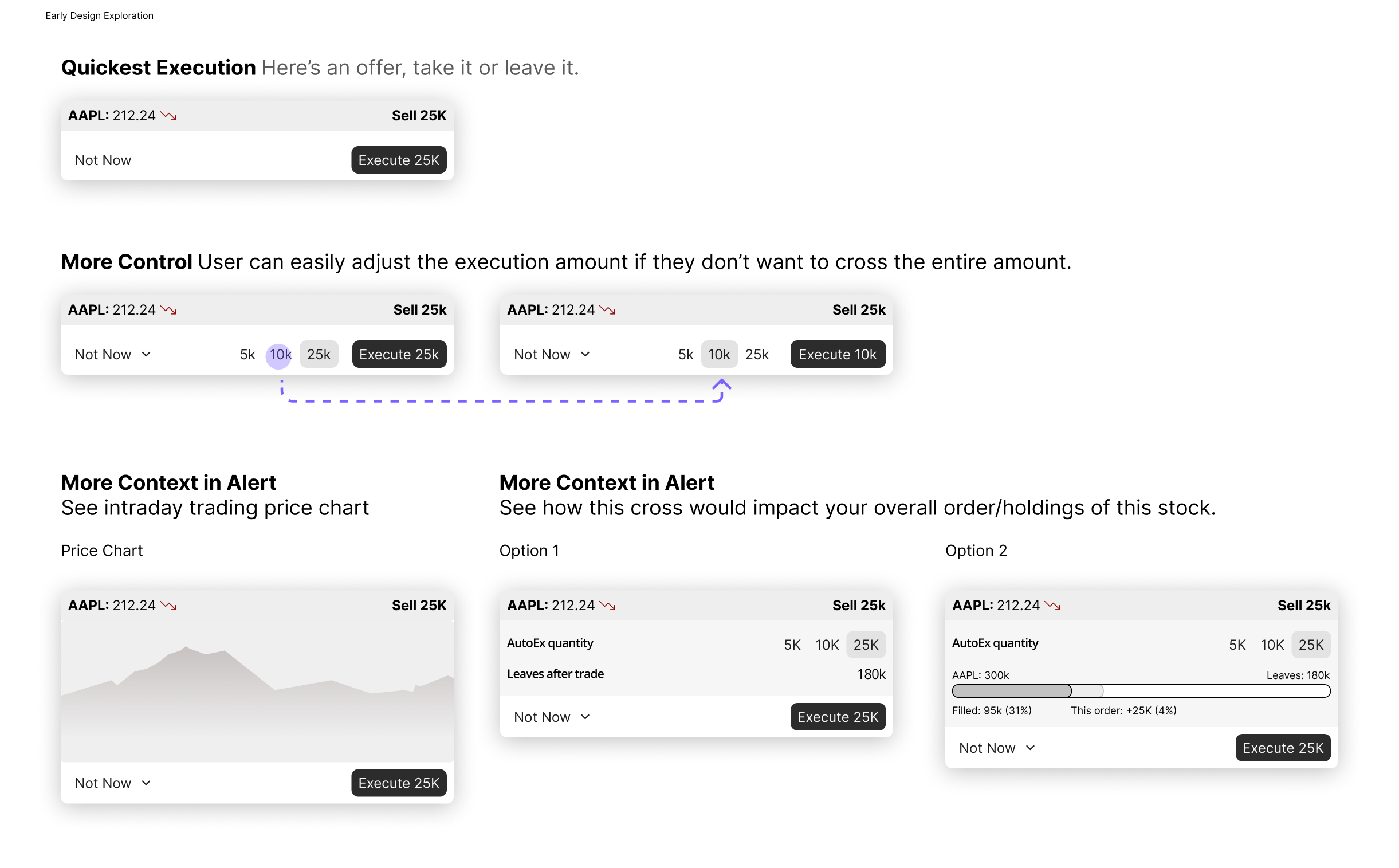
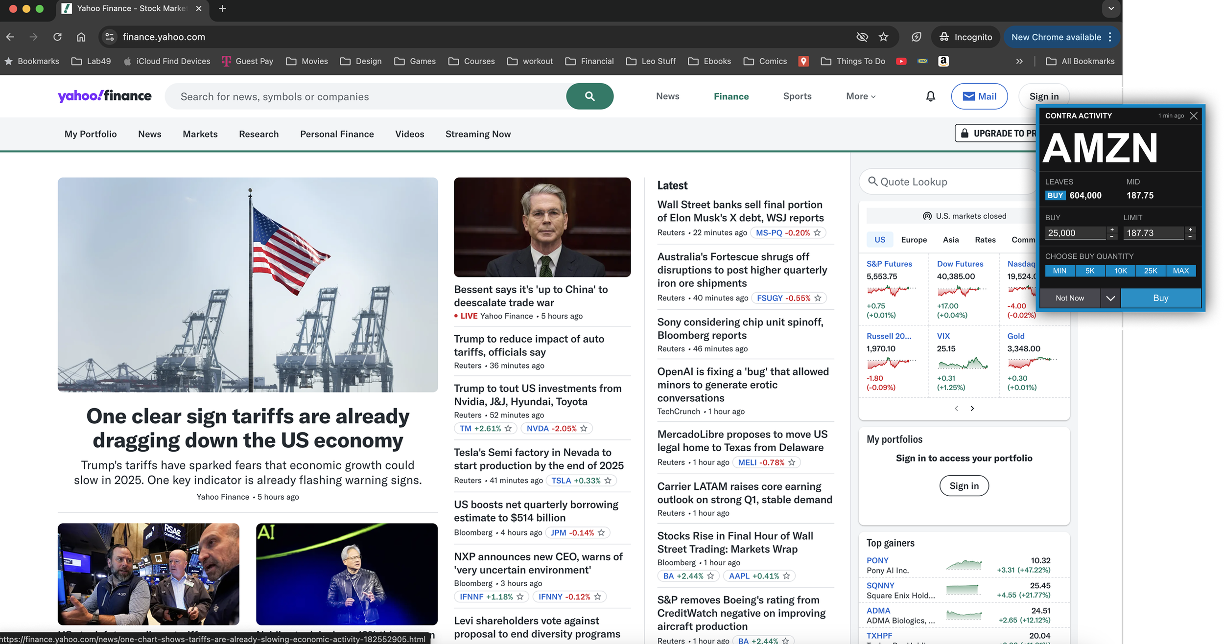
We explored three directions. The first: Quickest Execution - reduced the alert to a single button click. Fast, but fatally limited: if 25,000 shares were available and a trader only wanted to execute 10,000, there was no way to adjust. They'd have to dismiss the alert and miss the opportunity entirely. The speed benefit didn't justify that constraint.
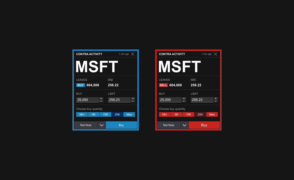
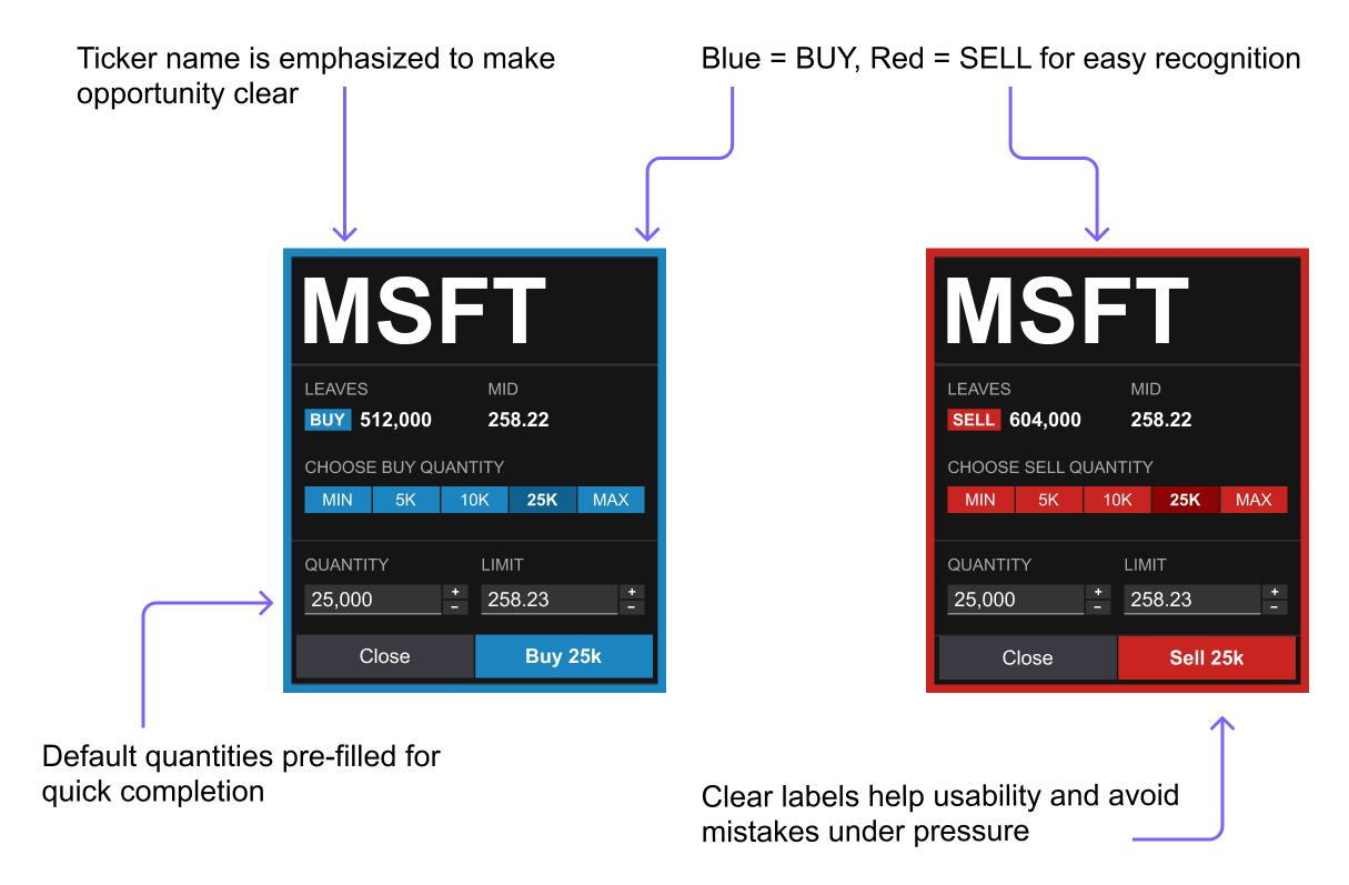
The second: More Control - kept execution fast while solving the flexibility problem. By pre-filling smart defaults and letting users customize their own personal defaults in Settings, traders could execute in a single click for a standard trade or quickly adjust quantity without losing meaningful time. This was the direction we chose: the efficiency of the first option without the critical limitation.
The third: More Context in Alert - explored adding information like price charts, remaining share quantities, and portfolio impact visualizations. Through research we found that while this information was occasionally useful, it rarely drove a trading decision in the moment. Traders monitoring a stock throughout the day already knew its price trajectory. If a trade opportunity appeared, they were generally willing to take as much liquidity as was available rather than recalibrating based on a chart.
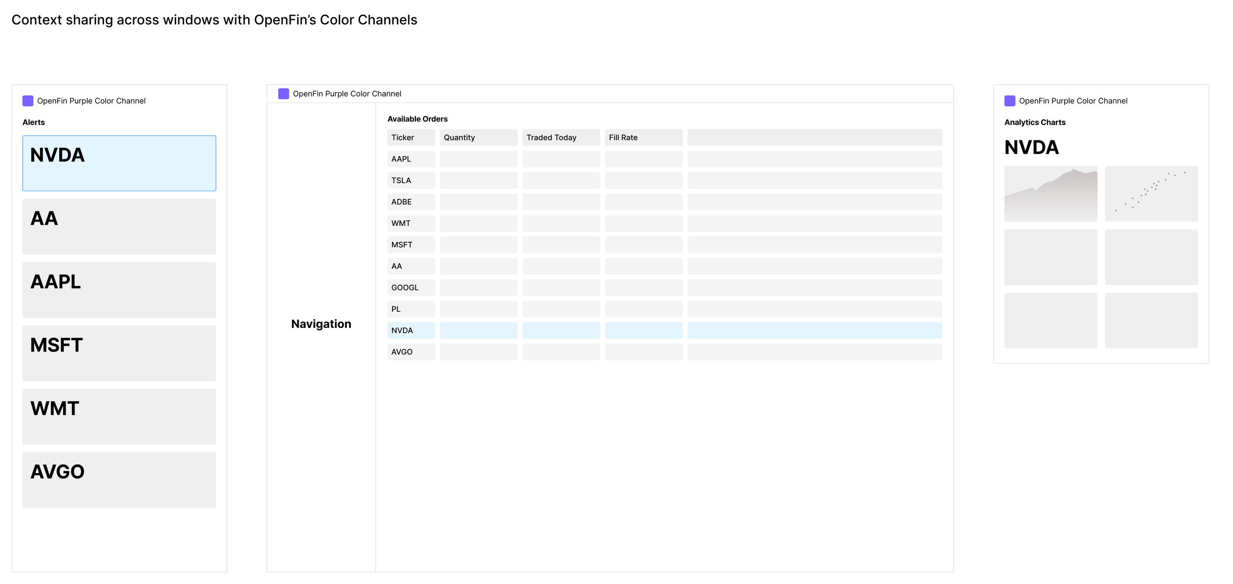
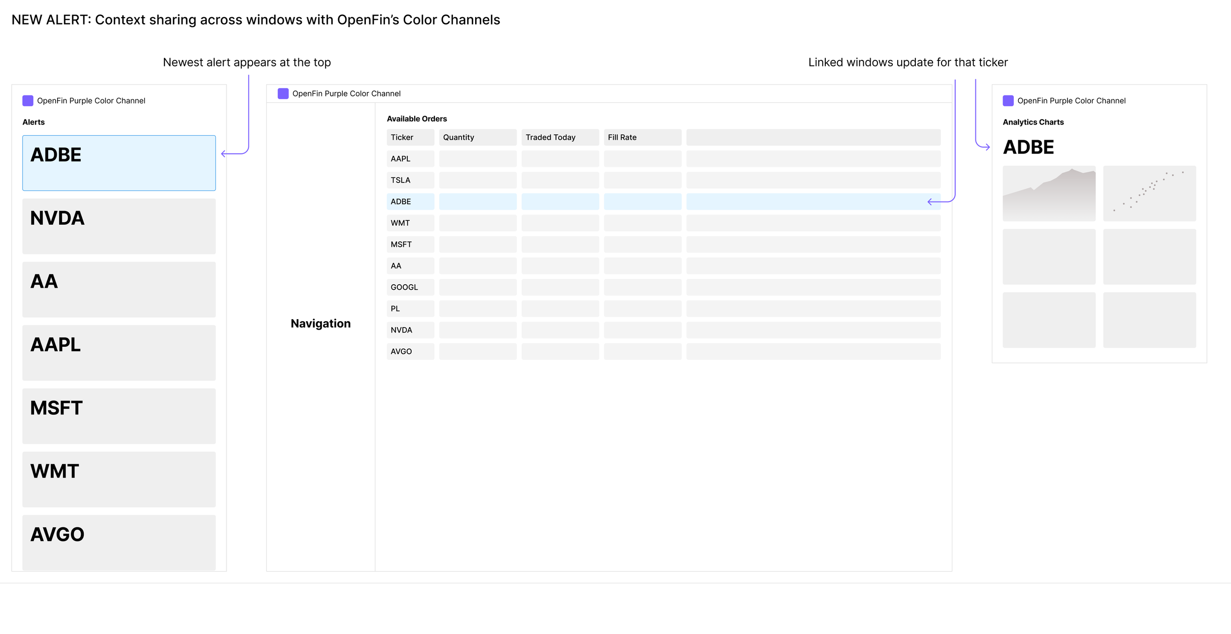
More importantly, including that context in the alert conflated two different jobs: executing a trade and monitoring a position. These are better handled separately. For traders who wanted price charts or portfolio context visible while trading, OpenFin's context-sharing capability offered a better solution - linking a separate analytics window to the alert so both updated in real time. This kept the alert purely focused on fast execution while giving information-driven traders everything they needed in adjacent windows they controlled.
Outcomes and Reflection
The discovery design was accepted by the client and received positive feedback from users. I then led the design team through a six-month build phase, designing all features of the product through to release. The engagement ended shortly after the product shipped, so we weren't able to track usage metrics or trading volume data after launch.
What we can speak to is the clarity of the problem and the directness of the solution. Traders were losing trades to competitors and to faster users within the same platform because the execution experience created too much friction. Every design decision in this case study — predictable alert placement, single-click execution with smart defaults, context offloaded to linked windows — was made specifically to reduce that friction. The hypothesis was straightforward: less friction means more completed trades, more completed trades means more revenue.
Given more runway, the metrics I'd have prioritized are:
Alert engagement rate — the percentage of users who choose to engage with this platform's alert when competitor alerts fire simultaneously. This directly tests whether solving the alert placement problem drove more users to choose this platform over a competitor in the moment that mattered.
Execution speed — average time from alert appearance to trade completion. This tests whether reducing friction in the execution flow achieved its core goal.
Failed execution rate — the percentage of times a user completed the execution flow only to find the liquidity already gone. Because traders race not just each other within this platform but users of competing platforms executing simultaneously, a reduction here would be a direct signal that this platform's users were winning more trades against the broader competitive field.
Together these three metrics would turn a well-reasoned hypothesis into a provable one.
The competitive dynamic that drove this project — multiple platforms racing for the same trade in the same moment — is one of the most direct relationships between UX quality and business outcome I've encountered. It made the design stakes unusually clear.